Infographic Topic
Designed by Jessie Zhang
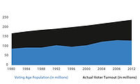
General Description: With my first number display, I am trying to communicate the number of potential voters of age relative to the actual voter turnout for the previous U.S. Presidential elections from the years 1980 to 2012. I want to emphasize that the turnout is low and encourage more voters of age to register to vote and vote in the actual Presidential elections.
Emulation Description: My number displays emulate the color model by utilizing the monochromic blue scheme and the visual language model by utilizing the flat iconography and shapes, as the number displays will not be the main focus of the infographic.
First display that exploits the visual potential of numbers
Critique #1: Hai Nguyen
Hai was surprisingly good at critiquing! He mentioned that the first version should have a title and a key with little blue and black squares, switch the colors of the text to match the graph. The second version was more clear; he thought the numbers should pop out a little more, perhaps by adding the color blue to the number "129" to improve color encoding. Hai suggested a line to separate the people from the text. He wondered what is the voting age population, so clarification is needed in the final display.
Model Emulation Feedback
To better emulate the visual language model, he suggested using circles in conjunction with the line graphs, such as the circle markers. The lines could have been a little thicker.
Revisions based on this critique
Based on Hai's feedback, I switched the colors of the text to match the graph and I considered a different way of displaying the numeric data, deciding to use a bar graph since it was more difficult to show the numbers with circle markers.
First Iteration
Final display:
Second Iteration
Critique #2: Hamzah Aly
The most important thing for Hamzah to notice was that there is no title. However he was able to understand the type of data that I was trying to indicate. He appreciated that I utilized two colors to generate interest due to strong contrast. For the second version, he liked that I bolded the number for emphasis and suggested that I should add colors to make these numbers pop out. He pointed out that the numbers do not match the fill of the blue in the number of people; it should be a little over 50%. Overall, he preferred the first version because he believed that the graphs are more effective than pictures in showing the data.
Model Emulation Feedback
He was not able to provide any suggestions for how the number displays could better emulate the visual language model. He liked that I used the same colors from the color model and that I was planning to utilize the light blue color as the background.
Revisions based on this critique
I chose to continue working on the first version.
Critique #3: Randi Mendel
For the first version, Randi asked: "What is the voting age population?" She thought it was a little hard to make an ssociation based on just the graph (e.g., what does all of the color coding represent?). She suggested that I could label a few points to give it a sense of where the numbers are at. To her, numbers seem disconnected from actual area. She preferred the second version to the first version in terms of type of representation of data point, which made it easier to make an association when you have people vs. graph.
Model Emulation Feedback
She suggested that I should add a way to indicate that the blue is the people who voted out of the total, perhaps by color coding the text or adding a key. I could simplify text by saying "129 of 235 million" since I did not need to specify US citizens both times. Condensing text would make it easier for the audience to understand the display.
Revisions based on this critique
Based on Randi's critique, I chose to modify the first version by separating the data points so that they do not seem disconnected.
Critique #3: Randi Mendel
She preferred the revision to the area graph in the first version. She liked how years are separated, which makes it easier for her to understand the display visually. She suggested that I should add titles to identify color coding. Overall, she thought that the revision better represented my idea.
Model Emulation Feedback
Randi commented that the revised graph emulated the color model better with more white space.
Revisions based on this critique
I was not able to incorporate much of Randi's feedback since she gave a positive review of the revised number display. I chose to keep the separation of the bars and added the legend for visually encoding the numbers by color as well as the title for the graph.
Critique #2: Hai Nguyen
Hai was pleased that the revised display had a line graph! He preferred it to the first version because it is clearer and he liked that you can separate the width to make it clear with nothing in between. It showed that I wanted to highlight each election.
Model Emulation Feedback
He suggested that I should highlight the numbers to show the difference, such as by comparing and contrasting the first and last numbers. He thought that I should take out the units and refer to the numbers in 100s instead of 50s as the display would look cleaner without clutter. Circles would be helpful in accomplishing the visual language model. Hai pointed out that I still needed a title.
Revisions based on this critique
Hai was correct in pointing out that the bars separated the data by years, so that the graph was easier to read. I decided to make the graph even easier to understand by utilizing the bar columns instead of stacked bars. I added the title and referred to numbers in 100s. I chose to keep the units, however, to aid the viewer in comprehending the numbers display.
Critique #1: Hamzah Aly
Hamzah appreciated that I was able to break out the data so that it is not one solid block anymore; rather it is like a histogram. He thought it was a cool, smart way to show the bars stacked.
Model Emulation Feedback
It is a strong emulation of the visual language and color models. He pointed out that it needs a title. Hamzah didn't know the exact numbers, so he emphasized that I should put in the actual values to make it easier for the audience to see. He suggested that I would not need to put in as many numbers for scale. However, if numbers fell on 50, he wondered if I could stick with 50 for scale.
Revisions based on this critique
I have added the title for my second revision of the number display. I decided to eliminate the scale of 50, choosing to use the scale of 100 instead. I realized later on that my second iteration improperly displayed the data such that the black bars displayed higher counts of people than the spreadsheet suggested. Therefore, I decided to separate out the bars in columns instead of stacks.

version 1
version 2
First Iteration
revision 2


revision 1
Second Iteration

Critique #3: Christy Pham
Christy thought that my second iteration was informative. She noticed that the white slice of the pie stood out. She was confused about who was the 55% that voted in the presidential election.
Model Emulation Feedback
Christy pointed out that I should have a title for this number display to make it more clear what the display was about. She thought that my number display emulated the color and visual language models well.
Revisions based on this critique
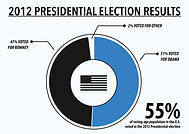
Christy brought up a good point -- I needed a title. I put down "2012 Presidential Election Results" and brought the text outside of the pie chart. I incorporated the icon of the American flag to better emulate the visual language model which used an icon as its centerpiece of the pie chart turned doughnut chart.
Critique #2: Randi Mendel
When I showed Randi my number display, she appreciated how it was easy for her to read the numbers. She was confused by the white slice since it was a little hard for her to see, as well as the tiny white wedge at the bottom of the display. Randi recommended that I should get rid of the white wedge at the bottom.
Model Emulation Feedback
When I showed Randi my models, she thought that the number display emulated my color model well. Her initial recommendation had been to utilize a different color for "Other," perhaps a light gray color, but after seeing my models, Randi suggested I could use an outline for this white slice instead.
Revisions based on this critique
I modified the second version of my first iteration in order to get rid of the white wedge at the bottom of the pie chart. I took the outline of the white slice into consideration but chose not to outline it because it was still clear it was an empty slot.
Critique #1: Yiqing Zhao
Yiqing thought that my second iteration of the number display was clear and easy for her to read. She was not sure about the white slice of the pie, since it did not feel important to her.
Model Emulation Feedback
To improve the emulation of the visual language model, Yiqing suggested that I should bring out the text outside of the pie chart as in the Pitbull model, so that it is easier for the viewer to read the information in terms of numbers. She liked the strong, bold graphical language and the use of the color model but suggested that I should outline the white slice of the pie since it was difficult to see.
Revisions based on this critique
According to Yiqing's feedback, I brought out the text outside of the pie chart and drew the lines connecting the text to the slices. I considered outlining the white slice but ultimately chose not to.
Critique #3: Morgan Evans
Morgan found it difficult to choose between the first and second version since she liked them equally. Morgan was fond of the doughnut style of the first pie chart and she also liked how information was presented in the second pie chart, such as the identification of "other" in relation to Barack Obama and Mitt Romney.
Model Emulation Feedback
She suggested that I should combine both of the pie charts but keep the percentages in the pie pieces. She pointed out that I did not need the text in the chart itself, so I could draw lines out from the chart to connect with the text.
Revisions based on this critique
As Morgan pointed out, there were the pros and cons to each of the pie charts. For this revision, I chose to incorporate the identification of "other" and the percentages in the pie charts.
Critique #2: Grace Kim
Like Cooper, Grace preferred the second version to the first version. She thought the second version was more clear and compelling, especially since she was able to compare the numbers.
Model Emulation Feedback
Grace recommended that I should add a title to both of the pie charts and lines on the outside to emulate the visual language model. She suggested that instead of having a color key, I could connect the slices of the pie chart to the candidates' names. As for the first version, Grace pointed out that there was no need for the light blue slice to stand out unless I was trying to emphasize that slice. Grace wanted a number for the first version.
Revisions based on this critique
Since Grace liked the ability to compare both numbers, I decided to keep the two numbers. I neglected to add a title to the pie chart, which I will do for my final revision. I wanted to emphasize that there were indeed "other" candidates that the voters voted for during the 2012 Presidential election, so I chose to keep the light blue slice.
Critique #1: Cooper Cain
Cooper preferred the second version to the first version because it was more clear, though for him it was hard to tell the difference between the first and second version. He likes the percentage number that was used in the center of the pie chart in the first version.
Model Emulation Feedback
In terms of feedback, he noted that the second version may not need to specify what percentage is used for whom since the candidates were already noted in the key. Cooper suggested that to better emulate the visual language model, the pie chart could have a distinct outline.
Revisions based on this critique
I decided to incorporate the best of both versions, by combining the percentage number in the middle, thereby retaining the doughnut style of the pie chart, and the clear numbers distinguishing the candidates. I added a distinct white outline to the overall pie chart to emulate the visual language model.
First Iteration
Sources: The data/inspiration for this display came from the following sources...
General Description: With this number display I am trying to convey the importance of voting in electing a Presidential candidate. Since Obama won the majority of votes with 51%, which not a runaway victory as some may think taking into account the third party candidates, the number display emphasizes how voting can turn the tide of an election and alter history.
Emulation Description: To emulate my models, I have chosen the pie chart to visualize the numbers, and I have decided to incorporate the flat iconography.
Final display:
Second display that exploits the visual potential of numbers
revision 1
Second Iteration

revision 2


version 1
version 2
First Iteration
